eCommerce Case Study - Lottery Lockdown
I’m not much of a lottery player, in fact, I’m not sure I’ve ever bought myself a ticket, and definitely never bought one online. Still, I understand these are multi-million dollar events that garner huge attention and purchase volume.
I was investigating the website and checkout experience for a lottery brand. There was a reported big drop in conversion in the checkout, even among direct clickthrough to buy call to action campaigns.
Before anyone thinks I’m picking on this charity, know that this was not the brand I was working on, and that all Alberta charities I looked at used the same third party checkout platform.

There are so many obvious challenges with this experience, I felt it made a great basis for a case study in eCommerce conversion fundamentals. Below are some highlighted notes that are all driven from the simple LIFT principles model I’ve explained.
Increase relevance and decrease anxiety
This checkout doesn’t look like a part of the actual charity site. It looks like what it is, a third party operated platform that you can put a basic coat of paint on. I probably receive several scam attempts per day about prizes I’ve won, contests to enter, etc. The amount of trust issues I’m programmed with as an internet consumer means I’ll abandon anything that seems fishy. When it comes to checkout conversion, and in this case, charity purchase conversion, you want to reduce anxiety. How do I know I’m plugging my credit card into a trustworthy site?
Ensure the look, feel and vibe of a checkout references the primary site. This can be done with logo treatment, font choice, site width, footer and other standard elements.
Decrease anxiety by indicating this is a secure checkout.
Increase clarity
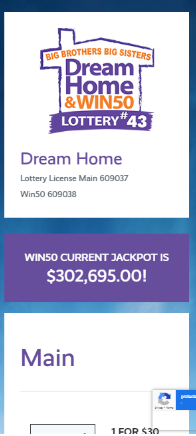
The first step in this checkout is called ‘Main’. That isn’t an eCommerce term I’m familiar with. I like to call upon Jakob’s law when reviewing carts and checkouts. Your goal isn’t to make your setup radically different, it’s to be as simple and understandable as possible. You might be inclined to add direction here on how to use this checkout but if you need a tutorial on your purchase path, you’re probably doing it wrong.
Breadcrumbs or laying out checkout steps is common and useful, but it should follow common checkout vocabulary.
Call your checkout what it is, a secure checkout! You’re not trying to disguise your purchase journey, you want people to know their on the home stretch of a purchase.
Reduce Distraction
Notice in the highlighted box for best value package, it describes the choice as 1 X 20 for $200? If you think about it for a moment you might realize that it means one of the 20 ticket packages. This is poorly constructed and doesn’t tell the story of the savings. Same with the multiple ticket options themselves, it doesn’t show the savings. If you’re getting 20 tickets at $10 each, as opposed to $30 per ticket individually, you say you’re saving $400 vs individual tickets.
Only show people what matters in a checkout, don’t force them to think about how to not get ripped off and spend too much.
Increase Urgency
There are several factors that impact the urgency of lotteries. The first is being communicated with the 50/50 value, but that’s not the big draw of these lotteries. There is a countdown of time to get the early bird, until the draw and the number of tickets available. There is a ton of fuel to pour on the fire of a lottery, and most of that story is missing. I go through a few examples of driving urgeny in my writing on promotional strategy.
Focus on the most compelling points of urgency. For a lottery, it’s often FOMO. How many tickets are left, days left to enter or limited prizes.
Design for Mobile First
The next massive problem is the mobile treatment. Picture coming to this via an email or clicking through from the website. Nothing tells me this is the lottery selection page, a checkout, etc. There is so much anxiety and confusion that comes from this experience.
There are some serious above the fold elements that could be considered.
A simple breadcrumb of checkout steps
A representation that this is the secure lottery checkout
Better use of space (lots of extra white space)
Replace ‘Main’ with some sort of make a choice message
Once again, I want to state that this isn’t a design choice by some lottery marketing team, it’s a third party application that these organizations have to use. There might not be much that can be done to improve this, but I can almost guarantee this treatment is costing customers.
When there is so much money spent on advertising across numerous digital and traditional channels, it bothers me to see a giant weakness at the critical point of conversion. You can spend thousands more to drive some traffic or spend a fraction to make some simple improvement to increase conversion.
You also have to consider that the big goal of these lotteries is to get new customers. These people are far less willing to accept a poor purchase experience, so measure your effectiveness against the most skeptical audiences.